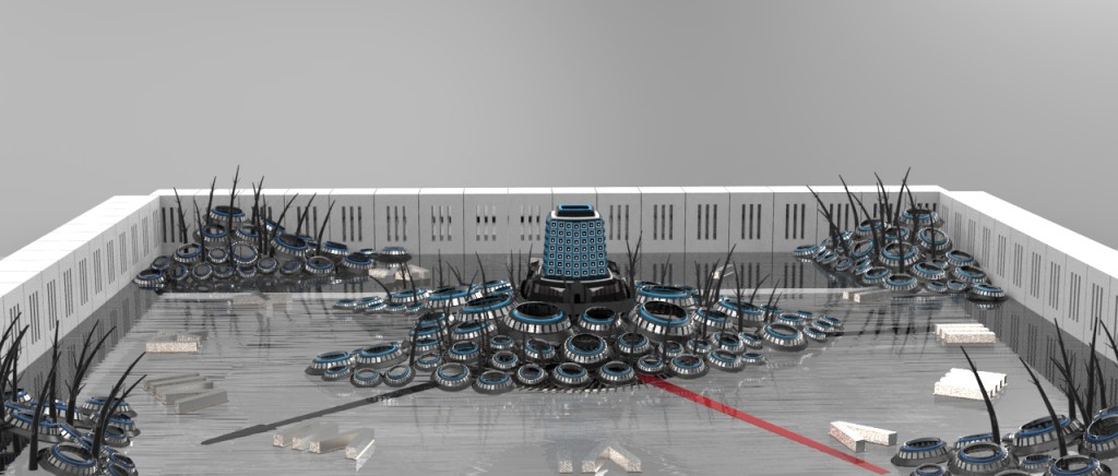
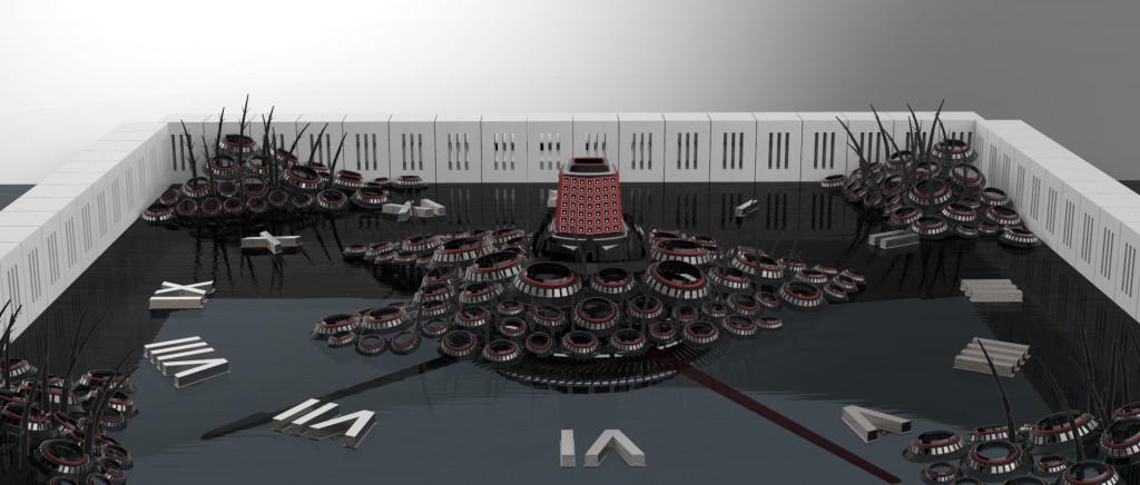
I am really glad that I was able to bring the model into keyshot to apply material. Initially, I resorted to my old styles which use mechanical and plastic materials. The result looks quite dull and doesn’t have that much emotional emphasis on it. I was initially very unhappy with the result.
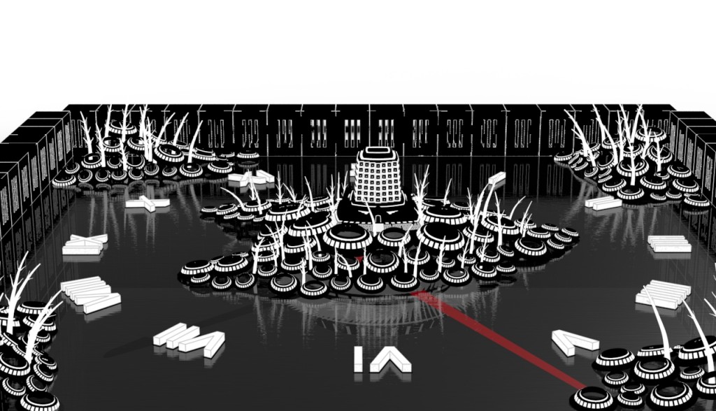
I decided to completely overhaul my own style, switching to a more flat and comic approach. The result turns out to have a lot potential! Since materials are almost completely vanished, the focus of the picture was turned completely into form. Even though there are little edges or contour, the form are still very recognizable. The audience would take the form as it is instead of getting distracted by the material.
Several possible modifications for the final render:
+ Make the hour hand and the minute hand more visible.
+ Extending the background to the hold picture frame and add a sun into the background to represent sunset (or the down fall)
+ Adding buildings and windows.
+ Adding sky castles and possibly some more “building circles” to truly represent unplanned growth. The circles right now still look to have some what an order into it.


